Over the years, Bigg Boss Tamil has grown from a reality television show into a cultural phenomenon. While the drama inside the house, memorable contestants and weekend episodes have kept audiences hooked, one element has remained a constant—the iconic Bigg Boss eye logo. With every season, the eye has received a fresh makeover, reflecting the visual identity and changing flavour of the edition. From metallic and royal designs to futuristic and edgy patterns, the logo has evolved significantly over the years. As Bigg Boss Tamil 10 marks the show's decade-long journey, here's a look at how the iconic eye has transformed across the seasons.
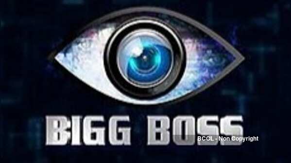
Season 1
The first season introduced Tamil audiences to the Bigg Boss franchise with a striking blue eye logo. Simple yet impactful, the design had a futuristic appearance and established the visual identity of the show. The iconic eye immediately became synonymous with the franchise among Tamil television viewers.

Season 2
The second season opted for a more elegant metallic gold and blue design. The intricate detailing within the eye added depth to the logo, while the combination of colours gave it a premium appearance. The design complemented the show's themes of secrets, emotions and unexpected twists.

Season 3
Season 3 brought a more vibrant and colourful appearance to the iconic eye. Bold shades and geometric elements gave the logo a lively look, reflecting the diverse personalities and high-energy drama inside the Bigg Boss house.

Season 4
The fourth season continued the franchise's experimentation with its branding by introducing purple and golden hues. The textured and symmetrical design gave the eye a mysterious and grand appearance, matching the intense gameplay and emotional moments of the season.

Season 5
Season 5 went for a bold, sharp and multicoloured design. The distinctive patterns inside the eye gave the logo a contemporary appearance, while its vibrant colour palette represented individuality, creativity and freshness.

Season 6
The sixth season embraced a royal visual identity with a golden eye against a sparkling backdrop. The luxurious design gave the logo a grand appearance and added a sense of glamour to the branding of the season.

Season 7
Season 7 took the eye in a completely different direction with an edgy, mechanical and steel-inspired finish. The detailed inner pattern created a sense of depth, while the metallic appearance reflected themes of strength, resilience and intense competition.

Season 8
Bigg Boss Tamil 8 opted for a sleek and futuristic aesthetic. The glowing blue ring against a darker background gave the eye a modern and minimal appearance. The relatively simple design created a striking contrast while retaining the recognisable Bigg Boss identity.

Season 9
The ninth season continued the franchise's experimentation with the iconic eye, combining metallic textures with a futuristic visual approach. The design retained the familiar Bigg Boss identity while giving it a contemporary makeover, reflecting another new chapter in the show's evolution.

Season 10
The Bigg Boss Tamil Season 10 logo marks a major milestone as the show completes a decade. The design features the iconic Bigg Boss eye in a striking red, black and metallic-gold palette, giving it a bold and intense appearance. The number '10' is prominently placed within the eye, symbolising the show's 10-year journey. At the centre, the camera lens remains a key element, representing the constant surveillance that defines the Bigg Boss format. The fiery red outer design, intricate metallic detailing and dark background give the logo a powerful and edgy look. The design also reflects the scale of the milestone season, while retaining the familiar identity of the franchise.
0 comments: